Creating a brand in its truest sense is far harder work than creating a logo: but ultimately, it’s the only way to achieve success.
5 Ways To Rebrand Without Touching Your Logo
Creating a brand in its truest sense is far harder work than creating a logo: but ultimately, it’s the only way to achieve success.

For many people, when they think of a brand they immediately think of a logo – that instant, visual shortcut and anchor on which everything connects to. Think Nike, see swoosh. But is it wise to pin so much on so little, especially in today’s omni-channel universe?
Brands are so much more than their main mark, and are becoming more complex, multisensorial experiences that go beyond simple ‘icon’ recognition to a place where building emotion and feeling is key.
A brand changing its logo alone isn’t nearly enough to create real change. When we think about how to modernise a brand, retain existing audiences and attract new ones, we need to go much deeper and broader. Here’s how.
Strategy is king
It starts with strong foundations. When a brand’s visual identity is rooted in its positioning and strategic thinking, it has focus and clarity – every element is aligned to achieve the same purpose.
Strategically defining a brand’s positioning means asking difficult questions: are we relevant? How can we refresh and energise the brand? Why should people care? The answers will never be just about a logo.
Successful brands root everything they do in a thorough understanding of their equity and core values. That understanding gives them confidence and consistency – while giving space to evolve and experiment.
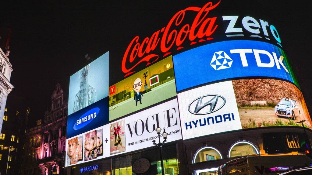
Compare Coca-Cola and Pepsi, for instance. The former knows exactly what it is, and its messaging across every element, campaign and territory reflects that: Coke remains relevant by a constant forward motion that never feels jarring thanks to the way everything comes from and aligns with its core ethos.
Pepsi on the other hand spent years flip-flopping between different logos, ultimately killing its brand equity without a clear north star in terms of positioning.
Harness your unique tone of voice
A brand’s tone of voice is what enables it to communicate authentically, powerfully and memorably with audiences – and should always be rooted in its positioning. As an alternative to a logo overhaul, brands can bring about equal, if not weightier, changes with a shift to their tone of voice.
Take Lidl: today, it’s known for an irreverent, cheeky, self-aware communication style (exemplified in this spot-on observation that ‘nothing screams ‘Middle of Lidl’ like a Toilet Night Light). But just ten years ago, Lidl barely had a voice: it was just a quietly functional, no frills discount retailer.
The brand shifted in 2014, and since then, its voice and messaging has aligned with two vital brand pillars – the instore retail experience and product range – where surprises abound in price, quality, and the treasure trove that is the middle aisle.
Work your brand assets hard
Pantone 2685C. Hardly synonymous with a brand you might think? Until you realise that this purple is Cadbury purple. A colour so interconnected with the brand that it can fly solo.
The building blocks of a brand world are expansive: colour palettes; typography; art direction; photography; illustration, UX, motion, sonics, and more. When used strategically, each of these individual elements can be incredibly powerful: an upwardly inflecting ‘mM’ for Danone (sound); MGM’s roaring lion (character and motion); or even the overwhelming smell of a LUSH store.
Each of those can be taken in isolation and do the heavy lifting for the brand all by themselves, such is their potency.
Tweak the product lines, not the logo
Sometimes, the visual assets might not need much work: instead, a brand needs to interrogate what, where, how, and to whom they’re selling.
Lotus Biscoff, for instance, was once little more than a small, crunchy afterthought served next to a hairdresser coffee or hotel room kettle. Then it launched a spread, and changed everything.
When we worked with John West tuna, it was clear that changing the logo wouldn't rejuvenate their brand. Research into supermarket trends showed that the front-of-store on-the-go sections far outstripped the tinned food aisles in footfall and sales; and that shoppers increasingly wanted healthier options.
John West had to shake off its ‘dusty tin, bunker-prep’ perceptions and become a convenience product, as well as communicating tuna’s benefits for heart health, immunity, and energy.
This was achieved with a combination of product innovations; on-pack messaging; newly ‘grabbable’ structural packaging; tone of voice work; new marketing and comms; and in-store moves, taking it out of the tinned aisles and getting it next to the bustling sandwich section.
The brand’s overall expression changed drastically, sales soared, and the logo remained unchanged.
Keep your logo, but know why
The power of nostalgia in branding is huge: Burger King’s much-celebrated 2021 rebrand showed that sometimes to move forward, you have to look back.
Likewise, many brands are beloved because of their heritage, like Brooklyn Brewery. Its designs were overhauled in 2022, but the logo – created by legendary ‘I ♥️ NY’ designer Milton Glaser for the brand’s 1988 launch – had to stay. Like Glaser himself, it had become iconic.
Some minor tweaks were made to the letterforms to modernise it for digital applications, but the main change was in creating a consistent, future-proofed design system that celebrates each beer.
The brewery’s range was totally revamped by unifying its huge number of variants, pack sizes and in-bar brand touchpoints. Everything remained recognisably ‘Brooklyn’ through bolder designs that prioritise clarity, allowing the logo itself to make a far stronger, prouder imprint.
In conclusion, maybe ‘rebranding’ needs rebranding
Creating a brand in its truest sense is far harder work than creating a logo: but ultimately, it’s the only way to achieve success.
Maybe it’s time we rebrand the word rebrand: if you change the logo and nothing else, I’d argue the ‘brand’ hasn’t necessarily changed.
Likewise, some of the strongest rebrands leave the logo alone, transforming a brand through tone of voice and assets like type, colour, photography and illustration – crucially, all based on rigorous strategic foundations.
Dave Timothy is managing director at Robot Food
Thanks for signing up to Minutehack alerts.
Brilliant editorials heading your way soon.
Okay, Thanks!

