
Tableau's Andy Cotgreave obsesses about data and he's been busy during the general election campaign. Here he boils the whole thing down into four data insights.
After an official 30-day campaign (and an unofficial one lasting well over six months), people in the UK are tomorrow voting for their next government. Andy Cotgreave, Tableau Software's chief technical 'evangelist', wades through reams of data generated to draw four conclusions from campaign season.
1. Don’t build charts based on data that doesn’t change
The Guardian's excellent poll tracker was let down by an electorate who didn’t change their opinions
As with all elections, the press and media developed elaborate visualisations of the opinion polls. Large amounts of time and developer resource are spent developing these. The problem is the data didn’t change. Despite all efforts by all political parties, the polls were static throughout the campaign. As a result all the media’s efforts were rendered boring – why go back to a chart when you know it’ll look the same as it did last week?
Companies focus on building one-off dashboards that show a representation of their business. They expect employees to return to these dashboards often, in order to track the business. Often, however, the dashboards become dead-ends, not visited by anyone. Why? Because the data doesn’t change.
The real value in data is being able to hunt down answers to fresh questions. If your data isn’t changing, then stop tracking that metric and look for one that is. You must see dashboards as evolving objects that need to change as you hunt out the most important answers.
Continuous new insights was the inspiration behind our election project, Impartiality UK. We took social media data and produced new visualizations every day during the campaign to look at the social election from multiple angles.
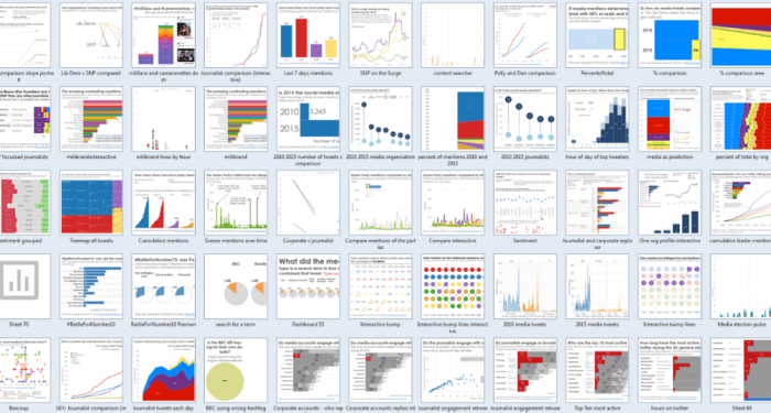
A selection of the many questions answered at Impartiality UK
2. Don’t lie with data
The party literature, as always, has produced some devious visualisations. Truncating axes and even making up data has been a problem in this election. This is at best patronising, and at worst, deception. In business, trust your audience to make the correct conclusions and show data truthfully. If your data doesn’t support your argument, don’t use it.
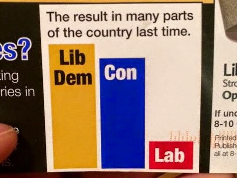
The results in many parts of the country"? (image from votingandboating.blogspot.co.uk)
3. Sentiment tracking is alluring but inaccurate
Lots of organisations (including us) measured social media during the election campaign. Social media is an excellent potential indicator of consumer trends and opinions. The temptation for many organisations is to showcase sentiment tracking during key campaign moments.
Audiences love this as it apparently reflects true emotional responses. However, sentiment tracking is inaccurate: I discussed that on our election blog. One example was the Daily Telegraph’s debate sentiment tracker. A disclaimer was added during the campaign acknowledging that sentiment is only accurate 60-70% of the time.
The lesson for business is not to avoid sentiment tracking, but to use it with caution.
Our own foray into sentiment tracking. It guarantees virality and engagement but is it accurate?
4. Visualisation is the new norm
Last year we explained how the football World Cup had normalised data visualisation: it was part and parcel of the conversation online. That is true of the election too. A look at the photo stream for the election hashtag (#ge2015) reveals that charts and data make up a significant proportion of the tweets.
Data should part of your business, too. People are increasingly data literate and crave accurate information which represents the world they live and work in.
May2015.com used Tableau Public to explain key election issues
Conclusion
The UK is likely to emerge from the election with a hung parliament. In this situation, the permutations and issues will be very complex. The next phase will produce more useful visualisations, as the media and politicians react to the myriad of choices.
Running a business is as challenging – every day brings new challenges, predicted or otherwise. As these challenges emerge, it’s vital to be flexible and be able to discover the story in your data quickly.


Most read in News
Trending articles on News
Top articles on Minutehack
Four Things We Learned About Data From The UK Election Campaign
Thanks for signing up to Minutehack alerts.
Brilliant editorials heading your way soon.
Okay, Thanks!