
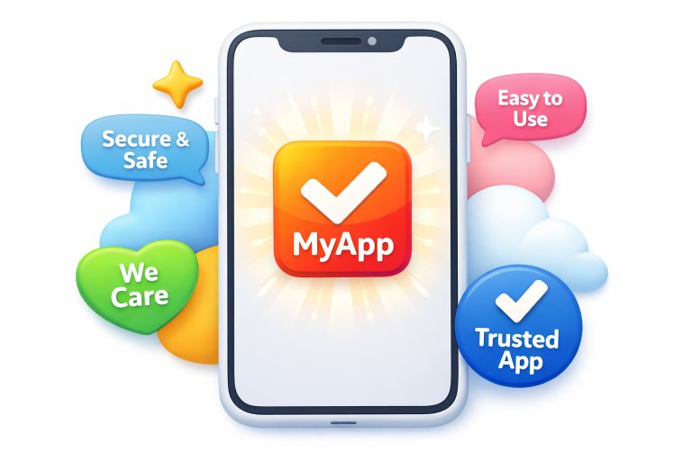
In a world where users juggle dozens of mobile applications, grabbing their attention in the opening seconds is vital. The visual language an app chooses, especially its logo, acts as the first handshake with the user. Trust is a fragile commodity in app onboarding, and a compelling logo can make an immediate statement of credibility and quality. When a mobile app logo is thoughtfully designed and strategically placed, it sets the stage for the entire user journey, helping to turn fleeting interest into actual engagement.
Whether an app is designed for fitness, productivity, or finance, the rapid judgments users make are shaped by details that communicate reliability and relevance. The logo, more than any other visual element, distills the app's core values into a concise visual cue. First impressions matter, and the right logo determines whether users linger or swipe away to the next download option.
The Psychological Impact of Logos
Logos are not just graphic marks. They are imbued with meaning, history, and emotional cues that can encourage or repel new users. According to research published by Verywell Mind, individuals can form opinions about a brand's trustworthiness, professionalism, and intent in mere fractions of a second based solely on the presence and style of its logo. This subconscious processing has huge implications for mobile onboarding, where milliseconds can influence retention rates and conversions.
When a logo is well matched to an app's personality and promise, it triggers instant recognition and emotional alignment. In contrast, poorly designed logos can introduce hesitation or skepticism, setting a negative tone for the onboarding flow. Users are keenly tuned to visual signals, so a high-quality logo is an essential ambassador for your brand.
Key Elements of an Effective Logo
- Simplicity: The cleanest logos communicate quickly and scale well to diverse screen sizes and devices. Uncluttered designs are easier to process and remember.
- Relevance: Effective logos embody the app’s purpose and desired audience, forging an immediate connection that supports brand positioning.
- Memorability: Distinctive design elements, whether through illustration, type, or iconography, make a lasting impression, aiding brand recall long after onboarding.
- Color Psychology: The color palette chosen can profoundly influence user emotion and behavior, as detailed by research from Verywell Mind. Different colors carry their own psychological associations that can intensify a logo's impact.
Integrating Logos into the Onboarding Experience
Strategic logo placement throughout onboarding can swiftly reinforce a sense of familiarity and belonging for new users. A logo should be featured consistently and prominently, from the splash screen to each progression point in the onboarding sequence. Cohesive logo integration, such as using the mark in transitional animations or interactive elements, helps guide users and makes the journey feel unified.
Beyond the practicalities of placement, using a logo as a recurring anchor point for actions or feedback during onboarding reassures users. It lets them mentally tie progress or success to the brand, increasing comfort and recognition.
Case Studies: Successful Logo Integration
Consider the example of a fitness application that redesigned its logo, adopting a bold yet minimalist approach with energizing color choices. After the rollout, the app saw a 15% boost in user retention during onboarding. This leap was attributed not only to visual improvements but also to a clearer, more motivational brand promise through design.
A financial management app similarly witnessed higher user engagement after embedding its streamlined logo into onboarding walkthroughs and interactive tutorials. The app’s consistent visual identity conveyed professionalism and security—key factors for users entrusting a tool with their financial data.
Common Pitfalls to Avoid
- Overcomplication: Detailed or busy logos can cause hesitation, as users struggle to discern meaning or intent, disrupting the flow of the onboarding experience.
- Inconsistency: Presenting different logo variants across platforms or screens disrupts visual coherence, making the brand harder to recognize and trust.
- Neglecting User Feedback: Skipping real user input and testing can allow subtle negative perceptions of the logo to go unnoticed, ultimately hurting onboarding performance.
Best Practices for Logo Design in Mobile Onboarding
- Conduct User Research: Engage with your intended audience early to explore preferences, expectations, and the effectiveness of various logo concepts.
- Prioritize Versatility: Ensure clarity, impact, and legibility at all sizes, so the logo delivers on tiny notification bars as well as larger onboarding screens.
- Test and Iterate: Collect authentic feedback and do not hesitate to refine both the logo and the onboarding sequences until positive user reactions are overwhelming.
Final Thoughts
A compelling logo is more than a static image; it is a dynamic participant in the onboarding process, shaping perceptions, influencing decisions, and strengthening brand loyalty from the outset. By focusing on clarity, relevance, and emotional resonance, developers can create onboarding experiences that capture users’ attention and keep them engaged. Thoughtful logo strategy remains one of the most cost-effective and impactful ways to enhance app adoption and long-term brand equity.
Key Takeaways
- A well-designed logo creates a strong first impression, influencing user trust and engagement from the start.
- Users form quick judgments based on logo design, making it a critical factor in onboarding success.
- Effective logos are simple, relevant, memorable, and use color strategically to evoke the right emotions.
- Consistent logo placement throughout onboarding builds familiarity and reinforces brand identity.
- Integrating logos into interactions and transitions enhances the overall user experience.
- Avoid overcomplicated or inconsistent designs that can confuse or deter users.
- User testing and iteration are essential to ensure the logo resonates with the target audience.
- A strong logo strategy can improve retention, engagement, and long-term brand loyalty.
Most read in News
Trending articles on News
Top articles on Minutehack
The Power Of First Impressions In Mobile Apps
Thanks for signing up to Minutehack alerts.
Brilliant editorials heading your way soon.
Okay, Thanks!